How not to be first in line for the ski season opener

October 17th, 2012 Comments off

Monday afternoon, Al gave the word: “[A-Basin] will be opening for the season on Wednesday.

In some parts of the country, that might not mean much, but here in Denver, Arapahoe Basin’s first day heralds the return of ski season.  It was to be the first American resort to open for 2012-13, helped in part by its position along the Continental Divide at around 11,000 ft.
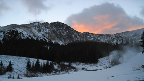
The East Wall at A-Basin at sunrise

“Want to go to opening day?” I asked Tyler.

“Yes,” he replied. And so it was settled.

After I hastily acquired skis and boots — I did a season rental the previous season, but it was too early to do that again — Tyler and I laid plans for Wednesday morning.  We hadn’t seen any solid numbers for past opening days at A-Basin, so we weren’t sure when we would need to arrive to secure a decent spot in the lift line.  We figured that arriving around 5:30 a.m. would provide sufficient buffer against the 9:00 a.m. opening time, so we settled on leaving Denver at 4:00 a.m. on Wednesday.

The alarm clocks blared at 3:30 a.m., and we got out the door on schedule.  An hour later, we were crawling up Loveland Pass amid falling snow, the steep cliffs and occasional snow plow demanding unyielding concentration.  It had been 80 degrees in Denver the previous day, but in the depth of night, 7,000 vertical feet above Denver, the temperature was only 25.  The relentless wind made it feel that much colder.

Twenty minutes on the pass, and suddenly we rounded a dark hairpin curve to find the lights of A-Basin laid before us.

We pulled into the parking lot and found few vehicles.  Those that were present were emblazoned with the logos of major Denver-area news media, including at least two satellite trucks.  The journalists outnumbered the subjects.

Giddy, we quickly unloaded our skis from Tyler’s Subaru, donned our ski boots and jackets, and clomp-clomped our way towards the slopes.  It was dark save for the lights on the snow guns, the TV lights, and one lonely Sno-Cat prowling the mountain.  We could barely make out the lifthouse, yet we trudged faithfully toward it.

…only to find that we were not the first in line.
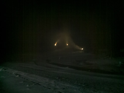
The darkness of the slopes was punctuated by the lights on the snowguns

Yes, there were others in front of us. It was 5:30 a.m., just as we had planned, and that was not early enough.

We chatted up the handful of guys by the dark lift.  How long had they been there, we asked?  The astonishing reply: since 9:00 a.m. the previous day.  Yes, the people waiting for the first chair were willing to take 24 hours out of their lives and spend it in the cold at the bottom of a chairlift.  That was more time than either Tyler or I were willing to invest in the endeavor.

Still, we were enjoying our time there.  Gradually, the darkness eased, and the first hints of daylight let themselves be known in the sky.  Fluffy clouds moved above the peaks, and dawn colored them so orange that the mountains seemed to be on fire.
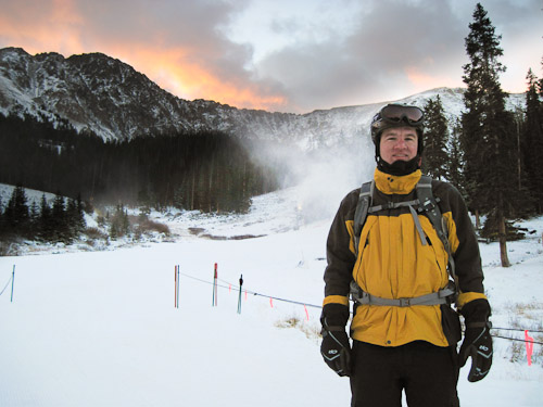
Me, early in our wait on opening day at A-Basin

More people arrived, and the maze filled out.  Several companies handed out free donuts.  Print and TV journalists worked the crowd, looking for new angles and interesting personalities.  The clock ticked towards opening.  The WiFi was turned on.

By 8:30 a.m., we looked forward and found but a dozen people in front of us.  We were queued up for the fourth chair.  Behind us, a growing sea of people.  Hundreds.  The mood was electric.

At last, slightly before 9:00 a.m., the barriers were taken down, and the crowd pushed forward.  Though the first two chairs were highly orchestrated and went to their rightful owners, the commotion that followed threw our patient waiting to the wind.

The crowd surged forward, and we found ourselves somehow bumped to the fifth chair.  A guy who had arrived after 8:00 a.m. but had snuck up the singles line made it onto the chair behind us.  One of our chairmates had arrived after 7:00 a.m.

It was madness, and I should have been irked, but… I wasn’t.  I was too giddy with excitement. Who cares if we got up the mountain 20 seconds later than we otherwise would have?  It was still skiing!

At the top of the lift, Tyler and I disembarked and ski-skated over to the top of the run.  We were in a rush; smiles were on our faces.

That first run down the mountain took just a few minutes.  Were the three hours of driving and three and a half hours of waiting worth the reward? Indisputably!
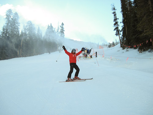
Tyler on his first run of the 2012-13 season

We celebrated with a beer and headed back to Denver.

How to sell software

October 4th, 2012 6 comments

In a milestone of sorts, my photo deblurring software Blurity received its first negative review today. This, after receiving numerous positive reviews on much larger sites over the past month.

While I could pick apart the author’s review, I’ll focus on two bigger ideas instead: that selling software is about managing expectations, and that selling software does not mean giving it away.

Selling software is about managing expectations.  No real software is perfect.  Real software crashes, has usability issues, and has limits in its capabilities.  Unfortunately, when users lack details about the software or don’t understand them, the expectations about the software can break free and ride well ahead of reality.  The challenge is how to keep users from being disappointed.

With Blurity, the comparison is inevitably made to the deblurring software that will “surely” be in “the next version” of Photoshop.  While Adobe did put together an impressive research demo of single-image deblurring in the autumn of 2011, they have since been mum about including the technology in commercial versions of Photoshop.  Why?  I suspect that they set expectations too high.

The most impressive images from that demo were synthetically blurred (a much easier problem than natural blur), and the deblurring results they displayed were the result of close user direction of the algorithm.  The real software, operating on real blurred images, in the hands of real users, probably can’t perform at the level of the technical demo.

The trade-off is always between perfection and shipping something at all.  Engineers and artists are notoriously reluctant to let go of anything that is not “perfect,” which is why so many products seem to die due to failure to ship.  In the case of Blurity, the decision was between shipping something that doesn’t quite meet the “Enhance!!!” Hollywood-style expectations of the populace, or shipping nothing at all.  I chose the former.

So how is a software developer supposed to keep expectations low while still running an effective sales campaign?  One way is to show numerous real-world examples on the web site, like I do with Blurity.  All of the examples are available for download in blurry and processed forms, so the user can do their own before-and-after comparison.  Going a step further, every image on the Features page also shows the exact settings used to produce the results.

Another way is to outline the limitations of the software.  This is done in the Blurity user manual.  It is also done with clear alerts display at runtime when the user attempts to do something that is not allowed.

Unfortunately, users don’t read.  I’ll admit it: I don’t always read the manuals myself.  So, I deal with this by providing great, personalized customer service.  Often times, the questions asked have already been answered in the user manual, but instead of giving a gruff “Read the manual!” reply, I simply give them the answer itself.  Quicker resolutions, happier customers.

Selling software does not mean giving it away.  If software is your business, it is there to make money. The most difficult and important change I made in the development of Blurity was to stop producing a free-trial version, and instead switch to a watermarked demo.

From April through the end of June, Blurity was distributed with a 30-day free trial. During those 30 days, it was completely unrestricted. Hundreds of people installed it, and almost nobody bought it.

I was crushed. I thought that the problem was that people simply didn’t like Blurity.

However, further investigation showed that wasn’t the case. Instead, many of the people installing Blurity had just a photo or two that they wanted to fix, and since the free trial fully met their needs, they had no reason to purchase a copy. What’s more, by the time the free trial expired, a month had elapsed, and Blurity had passed to the dark recesses of their minds — or out-of-mind completely.

My inner businessman silenced my inner engineer, and I got rid of the free trial period. Moreover, I made the demo watermark so obtrusive that there was no practical way to avoid it.

Example of Blurity watermarking

Switching from a free trial to a crippled demo was the best decision I’ve made in the history of Blurity. In the first month alone, sales increased by 2400%. Let me repeat that, just to drive the point: changing to a demo model, in which the only limitation of the unregistered program was to have a watermark on the output image, increased month-to-month sales by a factor of 24. If that was the wrong decision, then I don’t want to be right.

The heavy watermarking has been the most common complaint in reviews, and that’s fine with me.  Enough of the image is visible for the software to prove it works, and enough of the image is degraded by the watermark to ensure that there are no freebies.

The second most common review complaint? The price. Blurity used to be far less expensive than it is now, and raising the price substantially was the second-best Blurity decision I’ve made.  Blurity is priced on value, and there is nothing else on the market that can do what it can do.  While axing the free trial boosted sales volume, it was raising the price that made Blurity a viable business.

So how has that worked out for Blurity?

Up and to the right!

Great!


Turning the corner

July 27th, 2012 Comments off

About a month and a half ago, I reported that I’d made my first sale of my blur-removal tool, Blurity.  I was giddy; with that single first sale, I made more revenue that with my entire first go-around of Blurity a couple of years ago.  Still, even with that sale, Blurity was still losing money.  I’m happy to report that’s changed.

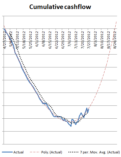
With cautious optimism, I think that Blurity turned the corner on July 7, and it is now cash-flow positive.

Cumulative cashflow for Blurity over the past 90 days

Granted, it’s not exactly profitable yet — there’s still quite a hole to dig out of — but at least the derivative is positive.

I had to make it work, and so I did.

How I got to my first sale

June 12th, 2012 4 comments

It finally happened: I sold a copy of my photo blur removal software, Blurity.  Two copies, in fact!  And it only took a month and a half.

Granted, I’m nowhere near cash-flow positive, and this project has been in progress in one form or another since the fall of 2008, but still, I’m giddy.

A demo of Blurity removing the blur from a photo

Here’s what I learned along the way.

1. If nobody wants your product, change your product.

There were two problems with the initial version of Blurity, released in the fall of 2009.

First, it didn’t work. It was really bad at removing blur from blurry photos, and that’s a hard sell when removing blur from blurry photos is its main selling point.

Second, once I got it to do something useful, I discovered that nobody wanted it as a web-based tool.  I had thought that a SaaS model would be good — upload your blurry photo, have the blur removed, and pay to get the deblurred photo — but what people actually wanted was a native PC version.

I hemmed and hawed, pulled the web version down last fall, and half a year later built a native PC version.  I launched the new version on April 27, 2012 while I was in Mountain View for an unrelated YC interview.

2. AdWords > Reddit ads > Facebook ads

When I relaunched Blurity at the end of April, I decided to try three different providers of display advertising: Google AdWords, Reddit ads, and Facebook ads.  I tracked conversions based on how many people downloaded Blurity and began a free 30-day trial.

Reddit ads: I bought two days at the minimum $20/day level for a Reddit ad.  After I complained about the ad traffic stats not showing up for almost two days after I launched my ad campaign, the Reddit support people comped me an additional $20 day, so I effectively had a total spend of $60.  From that, I had 145 clicks, for a click-through rate of 0.29%.  From those clicks, I had a single person download Blurity and start a free trial.  Cost per conversion: $60.  Yikes.

Facebook ads: I set up an account and tried playing with the ads, but I got basically no impressions at the $0.50 CPC bid level.  Given my expected conversion rates, I couldn’t justify going much higher than that.  In the end, I got 2 clicks, for a CTR of 0.03%, and zero conversions.  Fortunately, I spent only $0.95.

Google AdWords: I had played with AdWords a bit when I had the web-based version of Blurity up, but I had been using a very naive approach to keyword selection and display targeting.  I started with spending $30/day on AdWords with pretty much all of the settings on default.  My overall click-through rate was about 0.15%.  Then I did some research about how to better use AdWords, started tracking which keywords and sites were leading to successful trials (rather than just sending traffic), and I revised my targeting.  The most important move was splitting apart display ads and search ads.

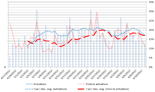
After the changes, my display CTR averaged 0.50% and my search CTR averaged 1.15% — huge improvements.  More importantly, my cost per conversion dropped by 35%, my overall number of conversions went up by 20%, and my daily spend went down by 25%.  Overall, my visit-to-trial conversion rate is now around 17%, and the cost per conversion is less than 5% of what it was with Reddit.

Free-trial activations and click-to-trial conversion rates. The conversion rate seems to track the number of activations because the overall number of visits is relatively constant.

Could I have improved the Reddit or Facebook conversion rates by revising the ad? Probably, but it would have required an enormous improvement to match, let alone beat, the AdWords results.

Cost per conversion over time. The dotted line is the 7-day MA.

Even though I didn’t have good luck with Reddit ads or Facebook ads, I have had several dozen trials started by people sharing links on those sites.  Thus, they can be useful tools — but not, it seems, if you try to pay them.

3. Native app development is a heck of a lot harder than web development

The old version of Blurity was all web-based.  I had a few browser differences to deal with, but most of the complexity was in the known, stable environment of my server.

The new version of Blurity was a native application for Windows PCs.  Everything worked fine on the computers and VMs I had access to for testing.  Once the software was out there in the wild, I immediately started getting a deluge of crash and bug reports.  It was sobering.  I’d say that a good 30% of users in the first week were unable to use Blurity at all due to bugs of various sorts.  Making matters worse, I had only extremely limited bug reporting built in to the software, and it was extremely difficult to reproduce some of the bugs on my development machine.

The first major change I made was to include much better crash reporting in Blurity.  It wasn’t a panacea — I’m still not sure why Blurity sometimes crashes on certain systems with AMD CPUs — but debugging became much easier in general once I had at least a stack trace to look at.

4. People will try to steal your work

I noticed a strange phenomenon about two weeks after launch.  A number of people were trying the same two invalid registration codes.  At first, I thought that there might be a bug somewhere that was causing the trial activation to show up incorrectly as one of those two invalid codes, but I found no path for that.

So what was it? It turned out that people were trying the serial number and registration number of my Blurity trademark.  It seems that they were just searching for “blurity serial number” and trying the first thing that popped up.  I was both amused that people could be so stupid and dismayed that people were so eager to pirate my work. (Not that I’ve been a total saint on that front, but still…)

5. Your first sale will take longer and be harder than expected…

The 30-day trial period all but assured that I wouldn’t have instant sales.  I expected that a rational person would buy only after the trial expired.  What did surprise (and alarm) me was how sales didn’t start magically showing up after 30 days passed from the first trial.

There’s a lot of doubt that creeps up when nobody is buying.  Are people unable to use the software? Is my purchase path broken? Is the software too confusing? Is the price wrong? Are my trial-to-sale conversion expectations too high?

6. …but when you do make that sale, it’s bliss

Then, finally, on June 9, it happened.  My phone vibrated, and I saw the message from Stripe: “You have just received a payment!”  Yay!  The feeling of validation was overwhelming.  Somebody had felt that what I created was so useful that they were willing to part with 49 of their hard-earned dollars to buy it.  Amazing!

Two days later, it happened again.  Another sale!  This time, it was from a customer named Paul.  Paul was one of my earliest adopters, and I’m indebted to him for sticking with me when Blurity was first refusing to install and then crashing all the time.  Little by little, thanks to his bug reports and patience, I got it to a state where it was much more stable.  Every company needs a Paul as a customer.

The second sale provided evidence that the first sale was not simply a fluke.  And that made it feel as good as the first.

Do you have blurry photos?  Blurity can fix your blurry pictures.


Eclipse

May 23rd, 2012 2 comments

Was seeing the annular eclipse in person a profound emotional experience?  No, but it was pretty cool.

Annular eclipses don’t happen very often, and they are usually difficult to see without traveling great distances.  Thus, when we learned that an annular eclipse would be visible in the southwestern US, Tyler and I decided to go.

After nine hours of driving, an overnight stop in Rico, Colorado, and a touristy photo-op at Four Corners, we arrived in Kayenta, Arizona.  Why Kayenta?  First, the full annular eclipse would be visible there, and second, the landscape features amazing rock formations.  It was those rock formations that tipped the trip in favor of Kayenta as opposed to the much closer (to Denver) Albuquerque.

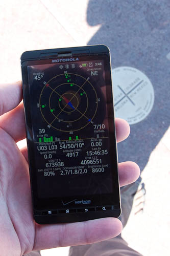
Checking the accuracy of the Four Corners marker.

With an hour remaining before the point of maximal eclipse, we started driving around unpaved roads in the Arizona desert.  We had to find a piece of landscape that was both interesting and in the right spot.  Several candidates were beautiful but far too close, and several others would have been great had they not been so far south.

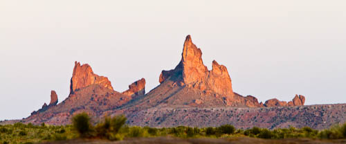
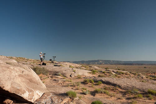
Some of the rock formations near our shooting site

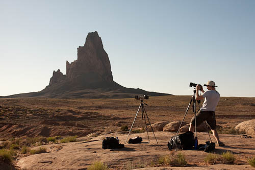
We drove and drove, bumping up and down the rough gravel roads, and then we found it: a rock outcropping with a great view of a tall rock monolith. We set up our cameras using the longest (if not the sharpest) glass we had available.

Shooting location

The shooting location from the other direction. For reference, that peak in the background has a prominence of about 1000 feet.

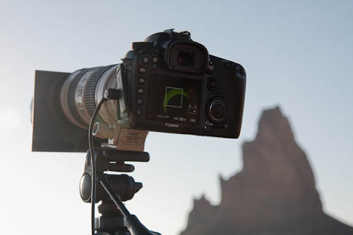
Slowly, the moon began transiting the sun.  We watched through the welders glass both directly and on our cameras’ screens.

Partial eclipse as seen on my DSLR's live view

The light got dimmer and dimmer.  Through the very dark filter, we could see the sun’s detail, but without the filters, it was still just a brilliant blob in the sky.

Finally, the moment came, and the sun became a ring around the moon.  We snapped photos, watched in awe, and snapped more photos.

I slid the 12-stop welders glass filter up the end of lens, turning it into a makeshift 12-stop grad-ND filter.  That let me shoot the sun and the silhouetted landscape in the same frame; no post-production sorcery required.

The full annular eclipse and landscape in a single exposure (click for details)

After less than five minutes, the moon had reached the other side of the sun, and we were again watching a partial eclipse.  The photos continued, but without the distinctive ring.

I enjoyed the eclipse immensely. As I mentioned above, I didn’t get emotional, but I did have a huge grin on my face. It was a new experience for me; I was exploring.  Given how rare annular eclipses are, I doubt I will ever witness one again.

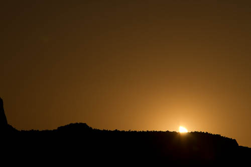
In time, the sun set.  The eclipse was not done, so it appeared as an unusual triangle of light slipping below the horizon.

Setting triangular sun

The trip was a success.  The welders glass worked well as a filter once we learned to stop down as much as possible.  I wish I had shot the start of the eclipse at f/45, which is what I used for the end.  At f/8 or even f/16, the imperfections in the glass caused horrendous blurring and ghosting.

The sun partially eclipsed, shot through welders glass at f/45 and color-corrected. Note the sunspot in the lower right.

Next up: the total eclipse visible in the central US in 2017.