The quest for decent photo prints
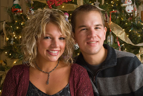
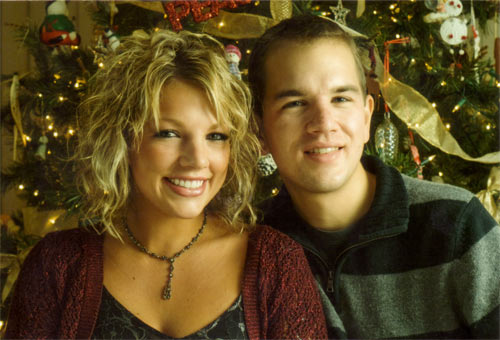
I didn’t think it would be too much to ask. All I wanted was a print of a photo I took of my sister and me last Christmas (click to enlarge):
My sister and me (Source image)
In normal situations, I would have ordered prints from Adorama in New York. They have always produced outstanding results, but they are far away, and I didn’t feel like paying $2.95 for shipping $0.50 worth of photos. Instead, I went local.
There are many local shops that print digital photos. I decided to go to the Target in San Mateo due to its proximity to an ice arena. I dropped off my images, played some ice hockey, and the picked up the prints.
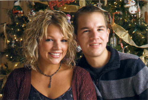
Decent, except too bright and really blurry (Target in San Mateo)
At first glance, they looked OK. It was clear that Target had brightened the image against my wishes — maybe an extra half-stop or so.
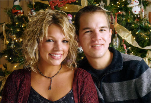
Unfortunately, upon closer inspection, the registration (the alignment of the colors) was clearly off, resulting in a blurry print:
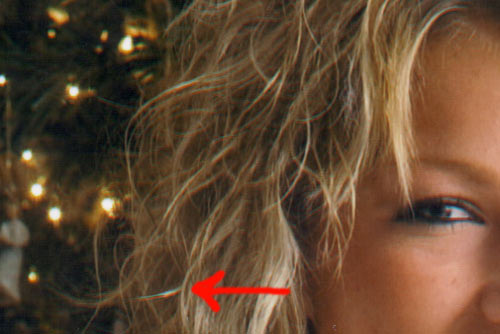
Really poor registration (Target in San Mateo)
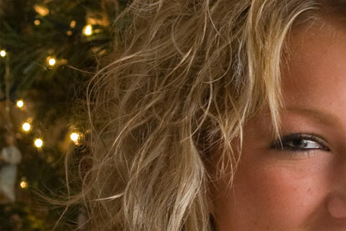
Everything is aligned (Source image)
Specifically, the red channel is off by almost a half-millimeter compared to the green and blue channels.
Disappointed, I went to a different store. The next one I tried was the Long’s Drugs in Redwood City. The result there? Well, Long’s had also brightened the image against my wishes, but at least the result was sharp:
Holy green cast, Batman!
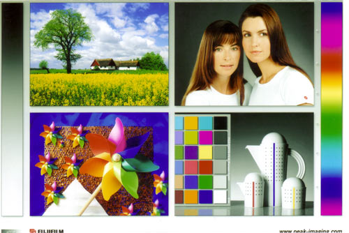
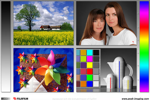
Wow, that’s some crap color. There was a strong green cast, which you can see by comparing the color calibration card I had printed there against the reference:
No, it isn’t your monitor or my scanner — the print really is that green (Long’s RWC)
Reference card
Ug. Next stop? The Long’s Drugs in Palo Alto on University Avenue. Let’s see how they did:
Too bright, but otherwise decent (Long’s on University in PA)
Success! Or at least, close enough. Like everybody else, they lightened the image against my wishes (I made sure not to select any of the image “enhancement” options while uploading my images), but at least the prints came out sharp and with good color. The blue channel is actually slightly off, but the human eye is relatively insensitive to errors in the blue channel, so that isn’t too noticeable.
For reference, here’s the color calibration print from the PA Long’s:
Good color (Longs on University in PA)
Decent. Note how the different gamut of the photographic process produces slightly altered colors. Compare the rendition of red, green, and blue on the Long’s PA card versus the reference card. That’s a function of the medium, so further improvement would require one to print using a different process, such as dye sublimation. Not worth the hassle in most cases.
What’s the moral of this story? If you want high-quality prints from digital files, order them online from a reputable outfit. If you absolutely must have them printed locally, be prepared to deal with highly variable image quality.
Dude you sister totally looks like Michelle Williams when she was in Dawson’s Creek
Nice comparison! I don’t think I would have had the patience.
I just got my first set of prints from Adorama. They look really nice (I got the metallic Endura paper), and they hand delivered them less than 12 hours after I ordered. I’ll definitely go back to them in the future.
Why does your sister look like my sister? They have exactly the same eye shape. The only part where I can tell they differ is my sister’s lack of chin.
Thanks! I’ve yet to see the Endura Metallic paper in person, but it sounds like some amazing stuff.
As for the similarities between my sister and yours, Amber, I can only speculate that perhaps both of our family bloodlines have strong German and Italian components?
And Halfpenny, yeah, I guess I can see some resemblance. 🙂
i just feel like mentioning that you may have spent more doing this experiment than just ordering from adorama – in which case you would have gotten better results anyway. regardless though – i like the summary. i’ve never given it too much thought as to the quality of a print – but i can easily imagine how difficult it would be [from an engineering standpoint] to faithfully print an image to paper.
Yeah, that’s what I should have done in hindsight. Also, if accurate color were of critical importance, I would have gone through many more hoops: calibrated monitors, ICC profiles, specific photo papers, and so on. Good color turns out to be one of those things that seems simple in principle but extremely difficult in practice. C’est la vie.
When someone sets up a new account with AdoramaPix (which is FREE!) they get 25 free prints. Many people use these free 4x6s to order some prints on all the different paper types. We usually recommend that you print something that you have already seen in print, that way you can compare. The only paper type we don’t offer in a 4×6 size is the Silk, but if you’d like to email me with your mailing address, I can pass it along and see that you get some samples.
Generally, the silk paper is very well suited for any kind of portraits, especially formal portraits like wedding shots. It delivers lovely skin tones and has a very delicate texture to it. It’s more matte than our Lustre paper. The Kodak Endura Supra Lustre has a slight sheen to it, not as much as the Metallic or Glossy, but it’s a good all around paper, a very fine surface texture and closest to “semi-gloss.”
The Supra Matt(TM) might be a good choice also, nice rich blacks and good detail with no texture to the finish – it depends on your subject matter, and personal preference.
Sincerely
Helen Oster
Adorama Camera Customer Service Ambassador
helen.oster@adoramacamera.com
http://www.adorama.com